The New York Islanders were the first of seven teams to reveal their 2014 NHL Stadium Series sweater. Surprisingly, they didn’t disappoint most jersey enthusiasts. When rumours started swirling that Reebok would be using “modern” designs for the Stadium Series sweaters, people expected something bad. When Reebok tries to go “modern”, bad things happen.
Toronto - November 30, 2013 - The New York Islanders were the first of seven teams to reveal their 2014 NHL Stadium Series sweater. Surprisingly, they didn’t disappoint most jersey enthusiasts.
When rumours started swirling that Reebok would be using “modern” designs for the Stadium Series sweaters, people expected something bad. When Reebok tries to go “modern”, bad things happen. Just take a look at Phoenix and Buffalo’s alternates as well as regular sets for Ottawa and Pittsburgh. Combine those Reebok rumours with the Islanders propensity to create sweaters which their fans loathe. Sweaters such as the Fisherman jerseys of the 90’s, and their original Reebok Edge sweaters. It seemed like a recipe for disaster, however both brands surprised us with something new and modern that also works as a hockey jersey!
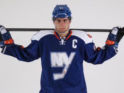
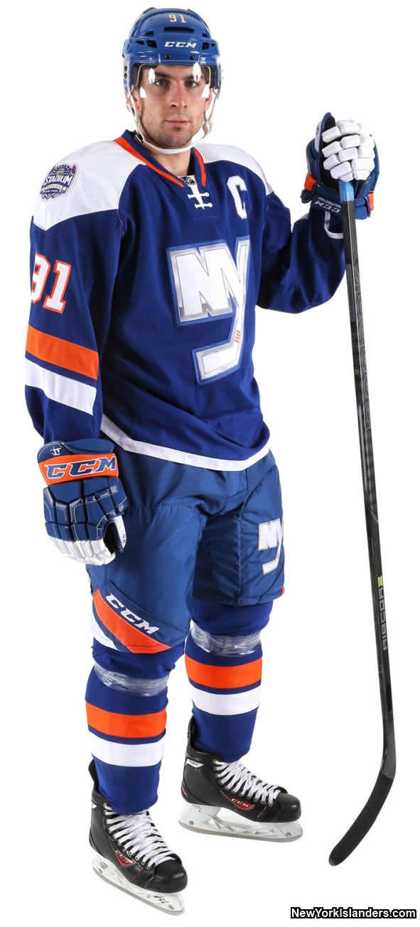
The shoulder yokes are white, but are stylized with a Reebok cut. The cut of the yokes is different on the front and back of the sweater. The stripes on the arms are angled and don’t go all the way around the jersey. This is the biggest draw back, but more on that later. The TV numbers on the sleeves also appear to be set at the same angle as the stripes, which has not been seen before. A stylized stripe design also appears on the pants, which seems to be another NHL first. The back of the jersey uses elongated player numbers, in traditional block style font, as well as a white namebar. Finally, the most notable feature is the “NY” chrome logo which is seen on both the front of the jersey as well as the left leg on the pants.
Perhaps if you were to read the previous paragraph without seeing the jersey you could piece together a terrible looking sweater with your imagination. Yet, somehow, Reebok has done a good job with this one. The new cut shoulder yokes look great. I think they work for fans of both modern and classic looks. The angled stripes on the pants that just end out of nowhere shouldn’t work, but they do. They actually look cool! I thought that the elongated player numbers on the back would end up looking like a Photoshop error direct from the design room, but they fit well with the modern look.
Before I pump Reebok’s tires too much I should mention the draw backs. The angled stripes on the arms that end out of nowhere, just like the stripes on the pants, don’t work. The stripes on the pants work as a splash of colour, but the jersey stripes don’t work because of the picture to the right.
When an Islander scores a goal at Yankee stadium and throw their arms in the arm in celebration, suddenly the jersey becomes very plain. Now it’s neither modern nor classic, it’s just boring. The next negative is the shoulder patches. On the right shoulder is the Stadium Series patch, and that is to be expected. On the left shoulder is the classic Islanders logo. Two separate shoulder logos look very un-clean and unprofessional to me. I would suggest that this sweater could have done without the classic Islanders logo on the shoulder.
This jersey does have its negatives, but the positives far outweigh them! Considering expectations were low I would say that Reebok did a very good job on this one. Reebok has impressed me by properly balancing a modern look while not going too over the top or outside the box. Sometimes Reebok designs a jersey and fans can’t find a reason for some of the design elements. Not on this jersey. One down, six more Stadium Series sweaters to go. Lets see if Reebok capitalizes on their success here.
My rating: 7/10
Ryan Haslett has written his own blog since 2009 (HockeyJerseyConcepts.com). His love of hockey jerseys will enable him to provide unique reviews and thoughts on new sweaters being released throughout the hockey world. If you have questions or wish to contact Ryan, you can email him at rhaslett@ourhometown.ca
3,472 Stories & Growing Daily...
To date HometownHockey.ca has posted a total of 3,472 hockey stories!
HometownHockey.ca offers a very generous revenue sharing opportunity for our Columnists. If you are interested in learning more details about writing for us, please send us an EMAIL.